As the last part of an intensive course in which they discovered the fundamentals of graphic design, students were tasked with completing a three-part final project: making an infographic. Using their newfound knowledge about what graphic design is and how it works, they had to analyze and determine what to include in their final product. Then, capitalizing on the insights they gained about making infographics effective and visually attractive, students worked in groups to sharpen the skills they’d need to create their own icon set. To wrap up this fun, yet demanding program, students presented their final projects, showing how they used top teaching methodologies to grow in the field while discovering how to meet the demands of the market.
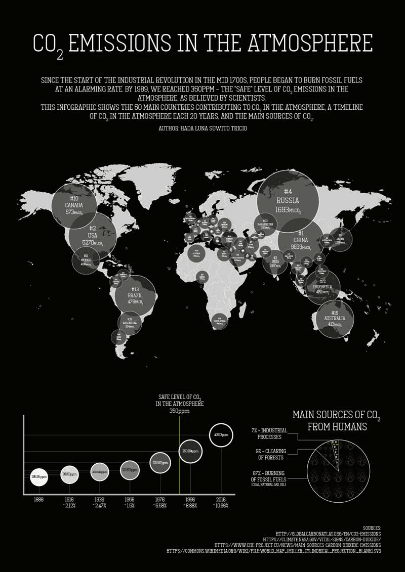
We could complete our final project in Graphic Design & Infographics on the topic of our choice, so I decided to create an infographic about CO2 emissions in the atmosphere. I included which countries are emitting the most CO2, the sources of these emissions, and a timeline. It was easy for me to pick this topic because my goal was to raise awareness of the dangers we are facing, since we have passed a “safe level” of emissions. Although my infographic only shows the 50 countries that emit the most CO2, we all contribute to the issue and have environmental habits that we can change. I hope that this infographic will help us all become more aware of how our actions affect our planet.