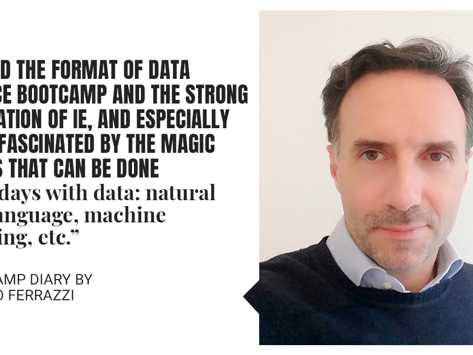
Lost in Data: How to Manage the Era of Excess Information
We’re living in an age of exponential information growth. The increase of social media interactions, large-scale internet use and technological advancements is generating data at a rate that’s impossible to keep up with. For the first time in history, we’re facing a new kind of problem: there is too much information for us to handle.
This inundation of information poses a challenge for businesses which struggle to make sense of so much data. They often find it too overwhelming to manage and present in a coherent way. As a result, they run the risk of missing opportunities to leverage data and make smarter decisions with it. Or, they fail to notice the fundamental issues that they need to work on in order to grow.
As today’s society is driven by technology, the only way for businesses to succeed is to harness the data they collect. They need to cut irrelevant information, find patterns and connections in data groups and create a way to make the data patterns tell a story that can be understood by a wide range of potential audiences.
Why is data so important for driving decisions?
According to Forbes, there will be 1.7 MB of new information produced per person every second in 2020. That’s a minefield of data and when leveraged correctly, it’s gold dust for marketing. Businesses can use it to learn about their prospective customers, better understand the market, target advertising campaigns and control their online reputation. This abundance of information is also invaluable for detecting risks and predicting problems.
But unfortunately, the vast majority of data is wasted—72% of businesses are currently collecting data that they will never be able to use. Instead of prioritizing data collection, businesses need to organize it in a way that’s easier to draw conclusions from.
And that’s where data science and visualization comes in
As highly visual beings, humans are more likely to retain information that they’ve seen, rather than information that they’ve heard. Sight is our strongest sense, so businesses need to find
a way to display data visually so the human brain can process it as effectively as possible.
On its own, raw data is just a collection of numbers, and in vast quantities it can be overwhelming. Data visualization helps to make sense of this raw data by displaying it in graphs, maps, images or charts which make patterns and trends instantly identifiable. When the brain associates colors and shapes with certain groups of numbers, that data tends to take on new meaning.
Learn how to leverage data with IE
The Data Science and Visualization program at IE trains participants to engineer smarter decisions to help their businesses navigate the quagmire of data and drive lasting success. The approach is both theoretical and hands on—students will learn to create displays that facilitate decision making by applying statistical data concepts. Then, they have the opportunity to put their skills into practice through the Tableau interface.
This five-week, online program is led by quality professors and experts from EdTech companies such as Google, Amadeus and McKinsey. Enroll today and learn the basics of data science through insights and visualization. It’s the most effective way to make efficient decisions and drive lasting success in any company.

Related posts

1 July 2022