A frequent consideration in logo design is whether or not the design is aesthetically pleasing. Simply put, logos that look good are more likely to generate positive associations and pass these associations on to the brand. How can managers decide whether or not a logo looks good? Often, they share this responsibility with commercial designers—trained professionals who know how to create logos that are pleasing to the eye. To do this, they follow the principles of good design, one of which is symmetry. Tons of research across a great variety of fields suggests that symmetrical designs—those whose parts mirror each other along an axis—are perceived as more beautiful than similar but asymmetrical designs. A reasonable suggestion, therefore, would be for brands to prefer symmetrical logos over asymmetrical ones, simply because the former are, on average, more beautiful.
However, symmetry has certain characteristics that may be undesirable for some brands. For instance, symmetry is by definition repetitious. Visual repetition may be boring to the eye, an undesirable connotation for brands that want to communicate high levels of enthusiasm and excitement. Inspired by these diverging perspectives, my colleagues and I recently investigated the circumstances under which a symmetrical logo can be preferable to an asymmetrical one and vice versa. The following are some insights from that research.1
For exciting brands, both consumer evaluations and financial valuations increased as the logo became more asymmetrical.
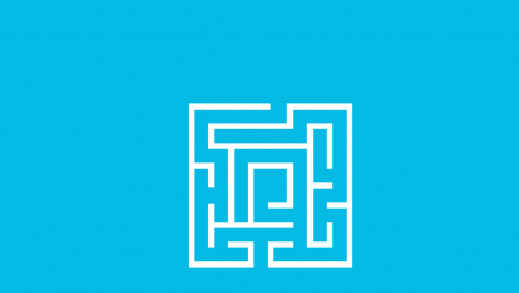
Symmetrical logos are good for a brand…
In one study, we examined whether symmetrical or asymmetrical logos can influence the brand equity of established brands. Specifically, we obtained the financial valuations of the top 100 brands as calculated by Interbrand, a leading consulting agency. We also obtained consumer ratings regarding key perceptions and evaluations of these brands from Young & Rubicam, another leading consulting agency. Moreover, we asked a panel of consumers to evaluate the logos of these brands in terms of how symmetrical or asymmetrical they were. The results showed that, on average, brands with more symmetrical logos not only were evaluated more highly by consumers but also had a higher financial valuation compared to brands with more asymmetrical logos.
…unless the brand has an exciting personality!
However, we found a striking exception to this pattern. Specifically, for exciting brands, both consumer evaluations and financial valuations increased as the logo became more asymmetrical. These brands were perceived by consumers to be highly daring, trendy, unique, independent, and up-to-date.
In the same study, we also examined whether brands perceived to be more exciting preferred asymmetrical logos over symmetrical ones. We did not find any evidence to support this proposition. Whether a brand had a symmetrical or asymmetrical logo was independent of whether it was perceived by consumers to be exciting. Thus, it seems unlikely that the above insights were incorporated into managers’ decisions about brand logos.
In a series of additional studies, we created logo pairs consisting of a symmetrical logo and an asymmetrical version of the same logo. We then asked participants to rate how well these logos reflect various aspects that are descriptive of an exciting brand personality (e.g., trendy, unique, etc.). We found that the asymmetrical logos were rated more highly than the symmetrical ones.
Taken together, the above results suggest that logo symmetry may influence brand equity through two different processes that may conflict with one another. First, more symmetrical logos are more aesthetically pleasing. Thus, brands with symmetrical logos can have higher equity. Second, asymmetrical logos are more congruent with brands that have an exciting personality. Because consumers generally prefer brands with congruent elements, exciting brands with asymmetrical logos can have higher equity.
It is not enough for a brand with an exciting personality to have an asymmetrical logo; it should also strive to align the levels of asymmetry and excitement in order to increase brand congruence and consumer preference.
Calibration matters
In yet another study, we created two different brand descriptions (one modestly exciting and the other highly exciting) and two different logos (one modestly asymmetrical and the other highly asymmetrical). We found that aligning the levels of excitement and asymmetry maximized brand preferences. Thus, we found that it is not enough for a brand with an exciting personality to have an asymmetrical logo; it should also strive to align the levels of asymmetry and excitement in order to increase brand congruence and consumer preference.
In summary, finding the best logo for a brand is a complicated task. The natural impulse to go with a beautiful logo may backfire if this beauty comes at the cost of brand congruence. To maximize the chances of good decision-making, it is important for managers to know what their brand stands for in consumers’ minds and try to communicate that to the designers. Moreover, these decisions may require fine-grained calibration, making the role of market research paramount.
1 These results are described in the paper “The Visual Asymmetry Effect: An Interplay of Logo Design and Brand Personality on Brand Equity,” co-authored by Jonathan Luffarelli (Montpellier Business School), Antonios Stamatogiannakis (IE Business School, IE University), and Haiyang Yang (Johns Hopkins Carey Business School). This paper appears in the February 2019 issue of Journal of Marketing Research. Link to the full paper: https://journals.sagepub.com/doi/pdf/10.1177/0022243718820548).
© IE Insights.