In the wake of the global financial crisis and the pandemic, government debt soared around the world. For many countries, public debt as a percentage of GDP is now at its highest level in recorded history, with the possible exception of wartime. Is this a serious problem? Can it be repaid? Will it lead us to crisis situations in the future?
This interactive map presents for you a small set of indicators related to government debt: GDP growth, government spending and tax revenues as a per cent of GDP, the annual fiscal deficit as a per cent of GDP, and total accumulated government debt as a per cent of GDP, during recent years so trends can be observed. This enables users to contrast how large public spending or tax revenues are relative to the economy, compared with other nations; and shows the differences in deficit and debt relative to the country’s economy. The countries included in the map are most of the member countries of the European Union, plus some major non-European countries for the purpose of comparison.
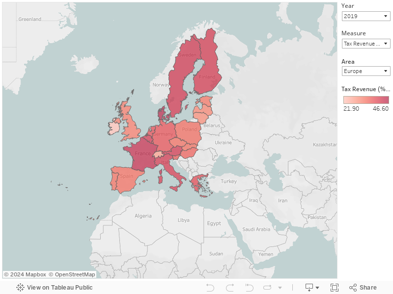
The source is the OECD, a think tank of developed countries that produces homogenous data sets for the countries it covers. Data for all years and/or all variables may not be available for all of these non-EU countries at the OECD. Still, it provides a useful comparison to the EU countries. Users may supplement this data with information from another data source, such as the World Development Indicators, if desired.
© IE Insights.