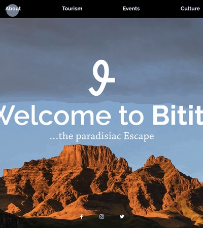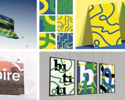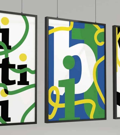
Bititi´s basic elements are based on the Island´s unique, diverse and vibrant culture. Students were inspired by the landscapes, textures and literature from Bititi to develop its playful and energetic visual identity.
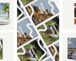
For the photographic style of Bititi, they chose close up pictures, which include narrow views of textures and patterns. They created a total of three vertical advertisements that provoke the viewer into wanting to learn more about the island.
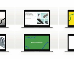
When developing the editorial touchpoints of Bititi, they explored the different integrations of the visual elements designed, by the use of the pattern, as well as, its photographic style. The primary typography chosen to be utilized is ´Raleway´and the secondary font is ´Chaparral´.
